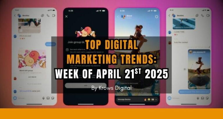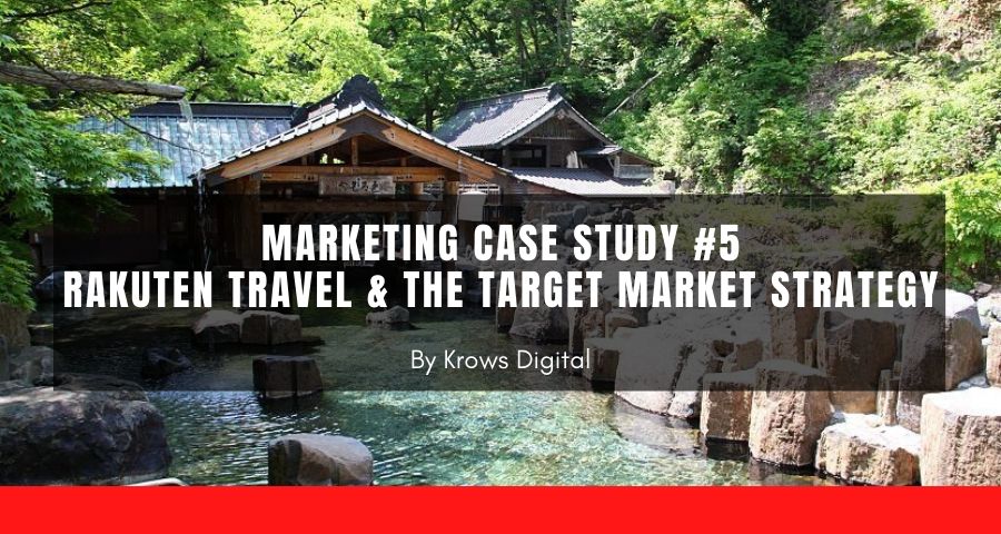
Target Market Strategy is the concept behind our 5th marketing case study and today we will be analyzing a website! So original right? But something simple to learn here: adapt your content to your local audience.
In fact, the audience interested in your products or services might not have the same exact profile and you will probably need to know how to adapt your message to each audience.
This is why we are talking about the Japanese monster company Rakuten but more specifically: Rakuten Travel.
What is Rakuten Travel?
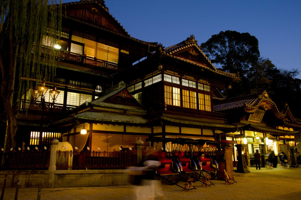
Rakuten Travel is a subsidiary of Rakuten, one of the world's largest internet service companies, and acts as Japan's largest online hotel reservation portal both for local and international markets. With more than 1.8 million room nights booked per month (source: Rakuten), Rakuten Travel is a serious player in the travel market.
Rakuten Travel's Target Audience
Difficult task to define the target audience of an online reservation portal as you are trying to target almost every audience: young, old, men, women, single, or families...
What can be done is to focus on age range, location, gender, and cultural behavior. This last criterion is what makes travel.rakuten.com a brilliant website.
They split their audience between the world and Japanese people in order to appeal to the needs of these 2 audiences. This is the core of a target market strategy: define the differences within your audience to better serve them.
This requires you to perfectly understand your core audience, what they like and don't.
Let's see how Rakuten is doing this.
Rakuten Travel's Website (Worldwide Version aka .Com)
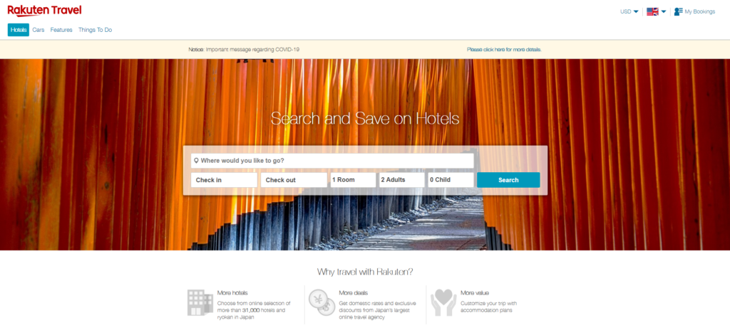
Here you have a look at the homepage of travel.rakuten.com , a nice minimalist design. In fact, many web designers will tell you that this kind of design with a good looking visual and a clear Call-to-Action, or CTA, (here to search right away for a room) is the most common type of interface as it is looking professional, improves conversions and avoids visitors to lose themselves into way too many pages (the shorter the way to convert, the better).
The attention of the visitor is directly aimed at booking. Nothing exceptional but well done.
You also have discreet switches to change language and currency.
If you check other websites, you will see that it is quite common to have a big and obvious CTA with a nice visual:
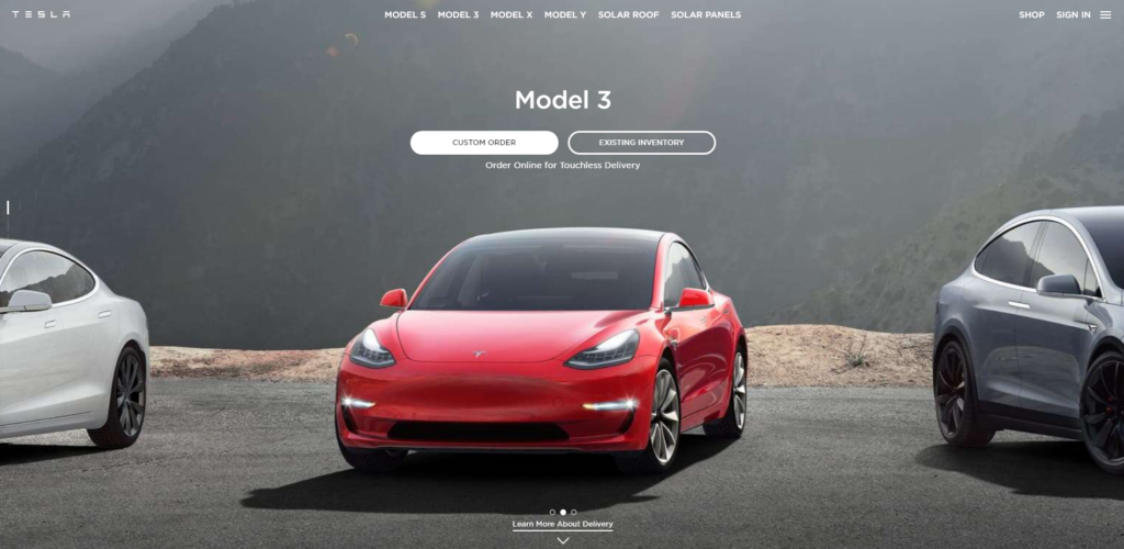
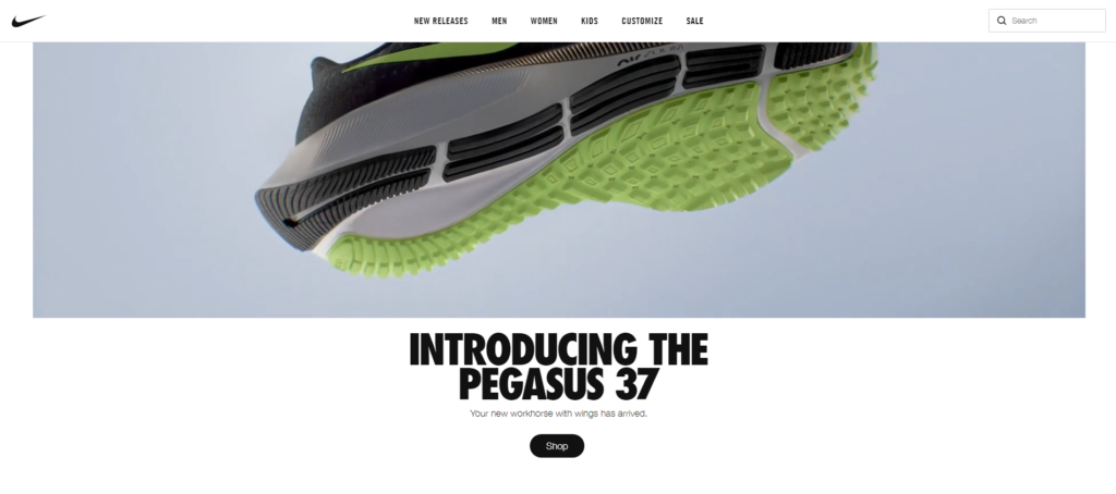
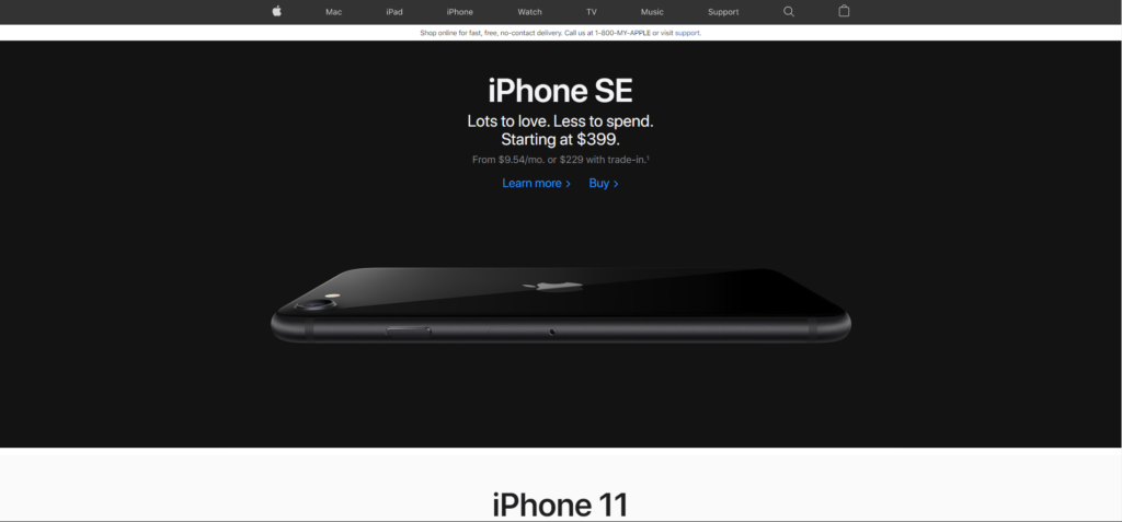
You got the idea, slick designs & minimalism is a great way to show authority. It provides a feeling that the brand doesn't need to explain itself: "you know why you are here so just do it." (thank you Nike for this one!)
BUT!

If this type of website works mostly worldwide, it is not always the case as we will see with the Japanese audience.
Rakuten Travel's Website (Japanese Version aka .Co.Jp)
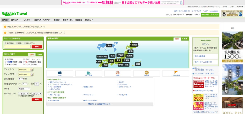
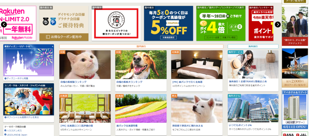
Ouch! Even for me, living in Japan since 2015, it still hurts! As you can see, there was quite a difference in design between websites for the Japanese and the worldwide version of Rakuten Travel.
This version is overwhelmed with information, no clear CTA, million options to choose from, promotions here and there... Quite a mess if you are asking any non-Japanese web designer.
But if you ask any Japanese designer, they will tell you that it is quite normal to see in Japan.
The fact is that the Japanese audience is quite difficult, they will not trust you right away and they don't care much about design, they care about information, as much as possible!
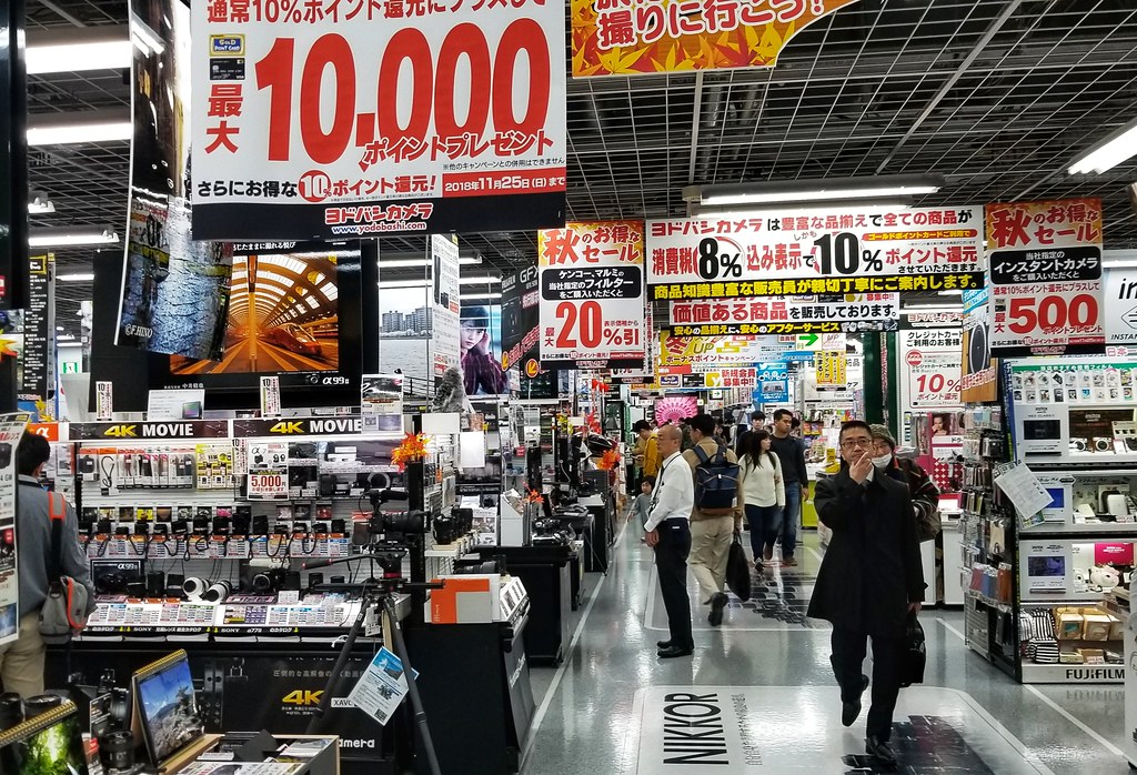
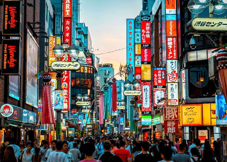
This is actually not only happening for websites but also for magazines, stores, in the streets, etc
Look at these:

After seeing this you can understand that it doesn't make much sense for Rakuten to have a minimal design with the minimum amount of information while targeting the Japanese audience.
If you want to read more about Japanese websites, here is a great article from RWS about this subject with nice examples of website adaptation like Starbucks.
Conclusion
We took this example to show you how important it is to operate a target market strategy by not presenting your content to all your potential customers in the same way.
Chances are that if your target audience is big enough, part of it will be receptive to your content while another one might not be.
Here, this example shows that just a simple translation would not have worked, they had to create a different website that fit the Japanese's desire for information.
It's important to understand who is your target and how to appeal to them.
Ps: no worries, if you are targeting Japan, you don't need to recreate a full (ugly) website but you should keep in mind that Japanese people want to know everything.
You have been warned!
That is also part of our work, at Krows Digital to help you translate and adapt your strategy/content/anything to local markets.
Contact us if you need help adapting your marketing strategy.
And as always, subscribe to our newsletter to not miss any more articles in the future. You can also check our previous marketing case studies if you missed them.
See you soon for a new marketing case study!